Everyday we are overloaded with information in all formats. It has never been easier to keep ourselves updated. However, it has never been more difficult to stand out from the crowd too.
With the amount of information we are exposed to, how do you catch someone’s attention?
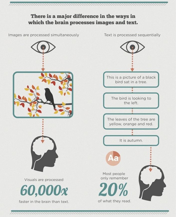
Talking about information attractiveness, 87% of people feel more attracted to read texts that are harmoniously arranged with figures (also known as infographs).
Why? Simply because 90% of all information transmitted to our brain is visual.
You don’t believe me? Check out this infographic below:
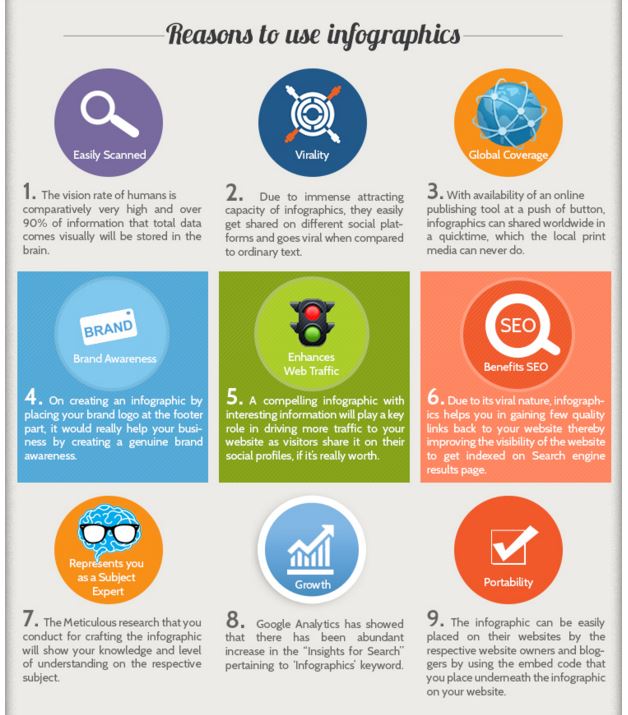
If you are not convinced to start using infographics right away, here goes a couple more arguments:
The same idea can be applied to the scientific world. How much time do we waste trying to explain in words something that would be better explained using images?
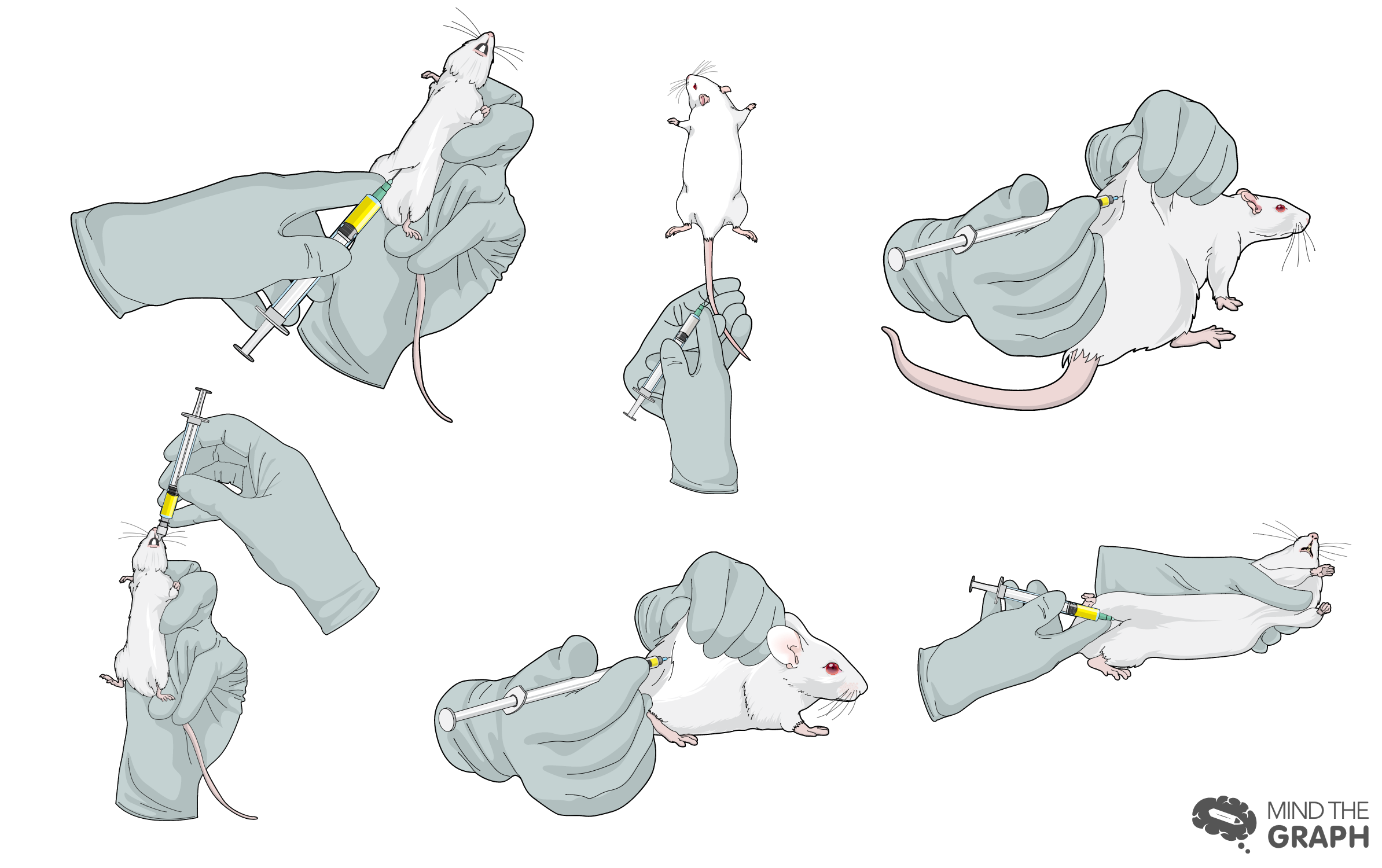
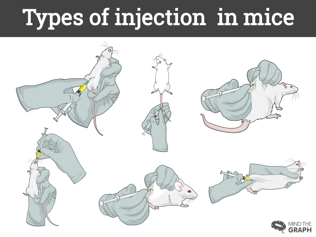
All of us had to write about our research methods for a paper or a project. Despite all our efforts to be as detailed and didactic as possible, other people still may find it confusing. This is the perfect scenario in which we could use images to help visualizing our research. A simple example can be the use of mice in science. One of the basic procedures is the injection in mice. How would you describe in a professional and simple way the procedures of injection techiques without making it sound repetitive?
Instead of explaining step by step, how about showing it?
The communication gap we have in science can be a huge problem if we ignore it. Thus, using different approaches to explain your work, not only helps other people in understanding, but also guarantees your work will be remembered.


Subscribe to our newsletter
Exclusive high quality content about effective visual
communication in science.