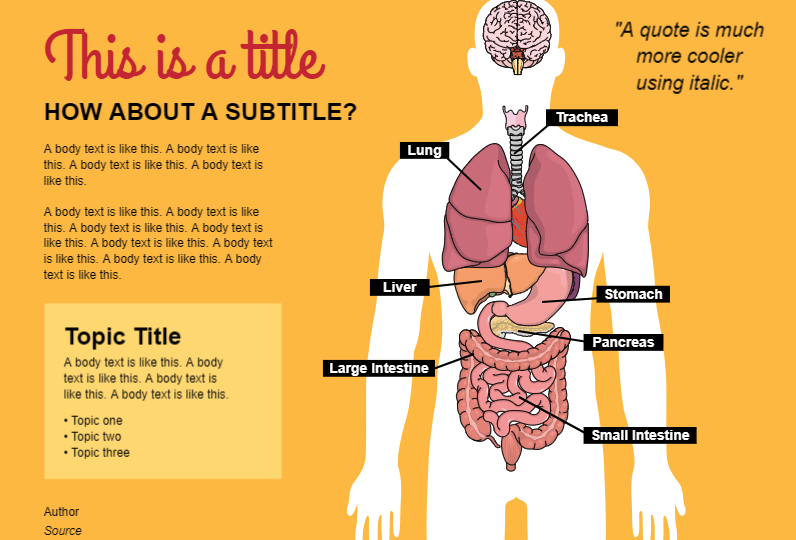
It is common to use two or three different species in a experiment. Besides that, taxonomists need to point the differences between related species. Graphical abstracts are a great tool to show these differences in an attractive and eye-catching way. You can use scientific illustrations and mix them with summarized information.
However, if you want to show comparison using graphical abstracts, there are a few thing you need pay attention. But don’t worry, I will share 03 tips and practical examples to help you create your own visual abstract.
01. You can use boxes and colors to split the content
It is important to organize the content, so the reader can understand easily what information belongs to the right specie. Boxes and colors are great tools to do that. Just pay attention to NOT pollute your graphical abstracts using not-matching colors. You can choose the same color and use different gradients or opacity. Look at this example:

I’ve used yellow and orange color progression because these colors combine with the feline illustrations.
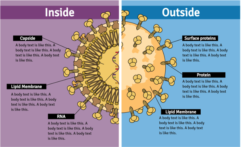
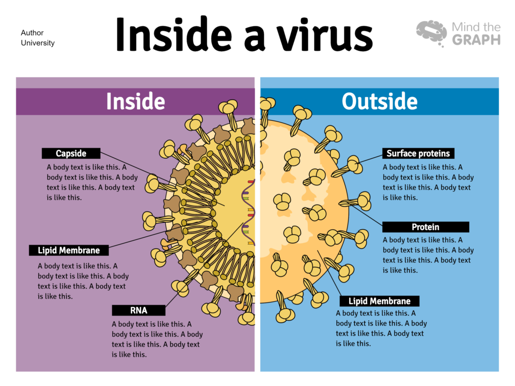
This other example don’t show different species, but it compares the inside and outside of a virus:
02. Compare the same aspects of each specie
I created a graphical abstract showing 3 different owl species. The content comparises the size, habitat, plumage and eye colors. It can be confuse if you cite an information like the color eye just for one specie. After all, if you do this will not be a comparision. 
Moreover, if you like to read about birds diversity, I already wrote a post with a beautiful infographic showing many birds species that you can see here.
03. Combine all the elements in your graphical abstracts
You must combine the size, view and position of the elements you are using. Don’t choose a illustration that not match with the others. You need to create a pattern with the illustrations, colors, text size and typography.
Look at this example of a graphical abstract that comparises three butterfly species. The first one uses illustrations in different views:
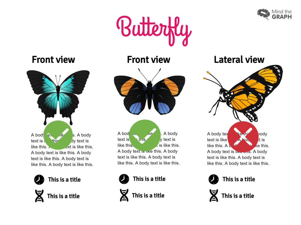
Now look at the right example, that shows the three butterflys in front view:

I made a video tutorial to explain better the ideia of choosing correct illustrations:
This and other tutorial videos are available on our youtube channel.
It isn’t easy to find accurate and attractive scientific illustrations on google. Because of that we provide thousands of scientific illustrations for our users. All these templates were made in Mind the Graph and are available for you. Moreover, if you don’t find the illustrations you need, you can request them! Amazing, right? So, why not start today improving your communication in science?


Subscribe to our newsletter
Exclusive high quality content about effective visual
communication in science.
