
Illustrations and infographics are great tools to show data and talk about controversial topics as medicial marijuana, steam cells, history of cannabis or politics. In these days, the usage of infographics became a tool more than a consequence. As a result, people are becoming aware of scientific infographic power to deliver information successfully. While beautiful illustrations catch your attention, the summary of data can brings new information and be very educational.
As said Jen Christiansen, science communicator of Scientific American Magazine: “By removing barriers (such as technical jargon), and providing context (in this case, the two constellations), the information is presented in an immediately intuitive and engaging manner.”
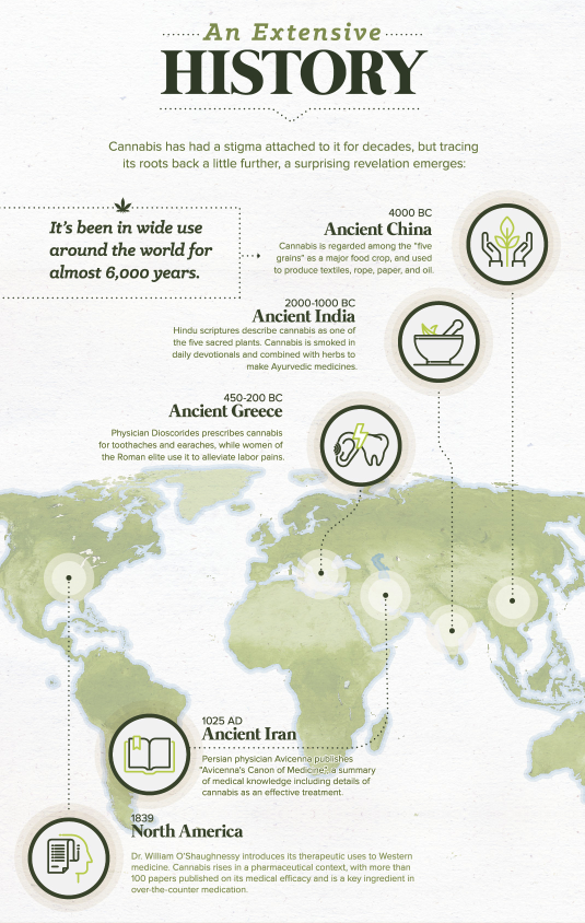
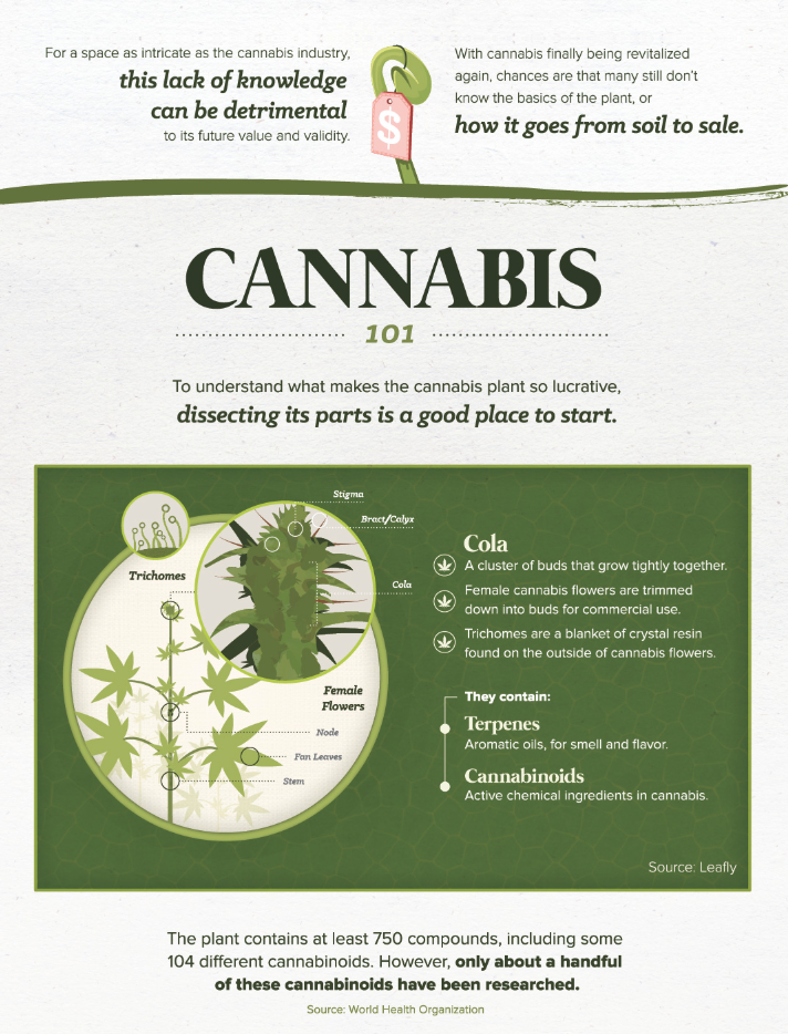
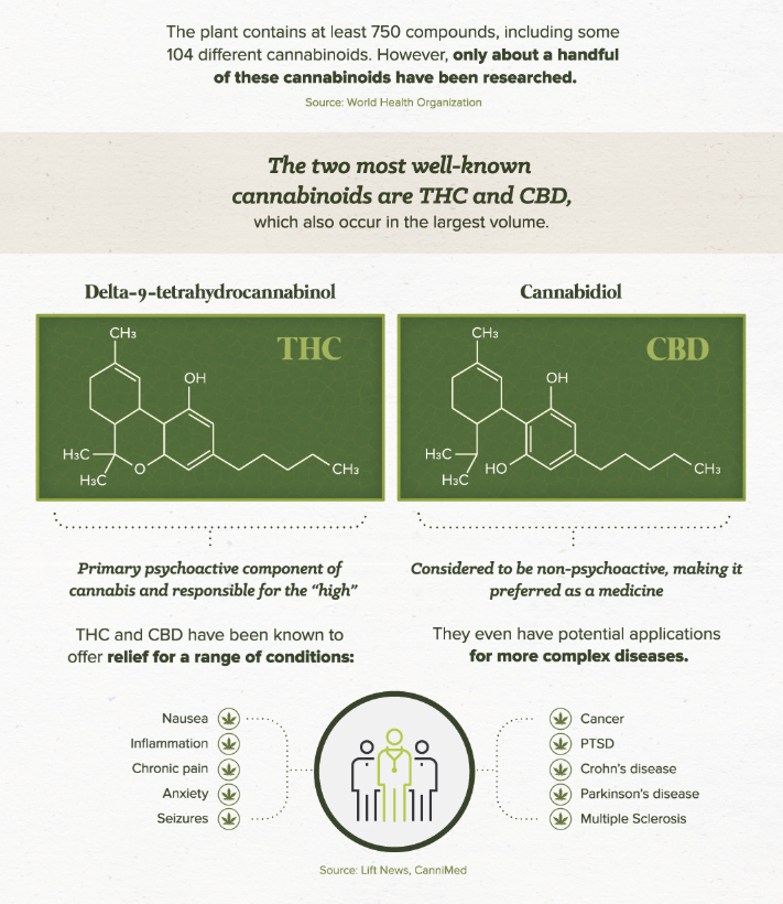
A good example is this beautiful (and big) infographic that shows the history of cannabis. It has brief and essential information with a beautiful design.
Therefore, if you are writing a paper or creating a presentation, take a look at this infographic. Even with a quick look, we can get ideas for information flows and build our own infographic or graphical abstract.
Cannabis – From Soil to Sale
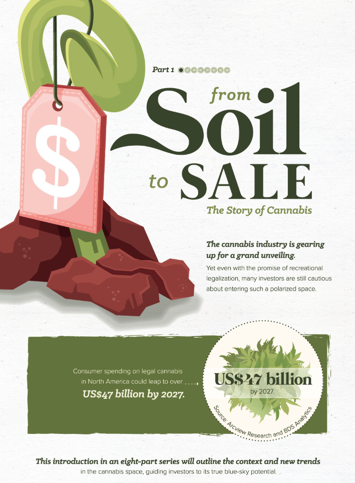
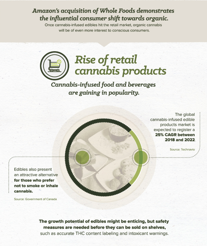
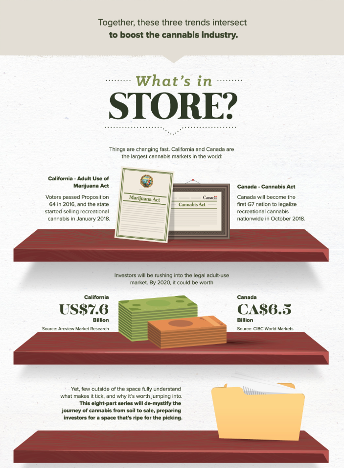
The infographic was produced by The Green Organic Dutchman Holdings Ltd. They are a research & development company licensed under the Access to Cannabis for Medical Purposes Regulations to cultivate medical cannabis.
Furthermore, visual information is all around us in the most varied ways. If you want to be part of it with your own work, take a look at our posts:
- Graphical abstract: The extra mile
- How to make a good infographic?
- Infographic maker? You must have it!
Or, if you think you are ready to try for yourself, LET’S GO!


Subscribe to our newsletter
Exclusive high quality content about effective visual
communication in science.
