This is the fifth post in the series How to make an infographic. If you missed the last post, you can read it here.
As I said in the last post, a picture is worth a thousand words. The illustrations are easier to understand and catch the reader’s attention. Therefore, in an infographic, it is essential to use text combined with nice images / illustrations.
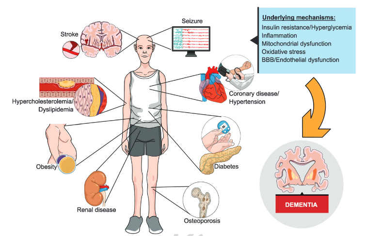
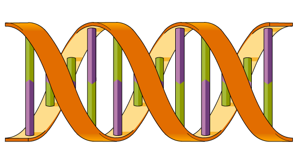
I know, isn’t easy to find accurate and beautiful scientific illustrations on the internet. Therefore, to help you with that, we have a scientific illustrations library with thousands illustrations available to our users for free.
Even then, sometimes you will not find the illustration you need in our platform. If that happens, don’t worry. Subscribers can request on demand illustrations. If you have any doubt about how this service works, read these posts:
Suit the contrast to a minimalist design
Our illustrations have a pattern, so you can use several illustrations and they will match each other to create a professional infographic. Still, you should pay attention to the contrast between the elements. Especially when you use illustrations and text.
In addition to using illustrations that combine with each other, you can use different versions and shapes if you want, to focus more on some elements and smooth others. Silhouettes versions and icons are great for a minimalist infographic, use them for secondary elements.

To select a different version of any illustration is very simple. You also can change the color of the shapes. If you never try it, go to your Mind the Graph creation and try it now:

If you still are not convinced, look this incredible example of a template created in our platform and improved in each edition. A more minimalist design helps you to read and understand without polluting the general visualization.


And finally, the last version:

Amazing, right? Do you want to see the process of improving the design of a graphical abstract? Our designer made a video for you! Click the button below and learn how to make your graphical abstract beautiful:
If you want to improve your communication and make awesome infographics, Mind the Graph is your place!
How to make an infograpic post series by Mind the Graph:
- Post #1 – Communication in science
- Post #2 – Make your data Awesome
- Post #3 – The right kind of chart
- Post #4 – Let’s talk about colors!
- Post #5 – Less is more: minimalist infographic design
- Post #6 – Mistakes to avoid in science communication
- Post #7 – A shortcut summary to GET IT DONE
The posts are a guide, made by our designers. They make the amazing illustrations and templates you see on our platform. Also, you can get for free our complete eBook: How to make science infographics and improve your presentations.
In our eBook you will learn:
- What makes a good science infographic?
- What is a good idea for a science infographic?
- How to organize the information flow?
- How to make it look like an artwork?

Subscribe to our newsletter
Exclusive high quality content about effective visual
communication in science.
