This is the seventh post in the series How to make an infographic. If you missed the last post, you can read it here.
I know, as a scientists we often have lots of content to show. Which makes very difficult the process of create slides for a 10-minutes oral presentation, a poster for a congress or a graphical abstract to communicate our research.
But, actually, it’s possible to summarize information and lots of data into a beautiful and eye-catching infographic.
To do that, first of all, you need to keep in mind that you shouldn’t (and can’t) show everything of everything. That’s the main idea of summarize, you need to establish priority. I know that this isn’t easy sometimes, but I am here to help you with that.
I’ve challenged myself to prove my point. I’ve made a single-page infographic to summarize all these posts of the serie “How to make an infographic”. The goal is to create an informational material to be a handy guide to Mind the Graph readers.
So, in this post you will follow my creation process.
If you want to make your infographic too, learn the best tips with our free ebook. Just click the button below:
Now, let’s review all steps and make a brief:
01. Define the goals
- Target public
- Burning problem
02. Choose the infographic type
03. Draw a sketch
04. Design: Colors, typography, size
05. Review: paragraphs, alignments, spacing, edit
And now, Hands on!
01. My goal
Create an infographic to be a handy guide, summarizing the content of the posts serie “How to make an infographic”. Furthermore, the text should have 300 words or less.
01.1. Target public: Mind the Graph readers, scientists, who want to learn how to make an infographic. The readers have different experience levels in creating infographics and graphical abstracts.
01.2. Burning problem: How to make an infographic.
Supporting questions: What is an infographic? How to summarize a lot of data? What I need to prioritize? How split up the information into small paragraphs and secondary headlines?
Probing questions: Why scientists should make infographics? How to improve scientific communication?
02. Choose the infographic type
I want to create an informational infographic, as a guide. The size will be 1500×1500. I’ll use an action (to show process, sequence) and an arrangment (highlight groups, order) model.
03. Sketch
Now, put your content into your template


04. Design
Colors, typography and illustrations

05. Review
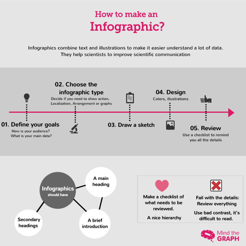
So, this is my final result. I hope you liked it.
How to make an infograpic post series by Mind the Graph:
- Post #1 – Communication in science
- Post #2 – Make your data Awesome
- Post #3 – The right kind of chart
- Post #4 – Let’s talk about colors!
- Post #5 – Less is more: minimalist infographic design
- Post #6 – Mistakes to avoid in science communication
- Post #7 – A shortcut summary to GET IT DONE
The posts are a guide, made by our designers. They make the amazing illustrations and templates you see on our platform. Also, you can get for free our ebook. Learn how to make science infographics and improve your presentations


Subscribe to our newsletter
Exclusive high quality content about effective visual
communication in science.
