Improve science communication is important to reach more people and fight against misinformation. Illustrations are a powerful tool to do that. As humans, we are a visual specie and images are helpful to understand something at a first glance because since a large percentage of the human brain dedicates itself to visual processing.
However, when we think about communication in science, we normally talk about graphical abstracts for papers, presentations or social media. But the gap is even bigger.
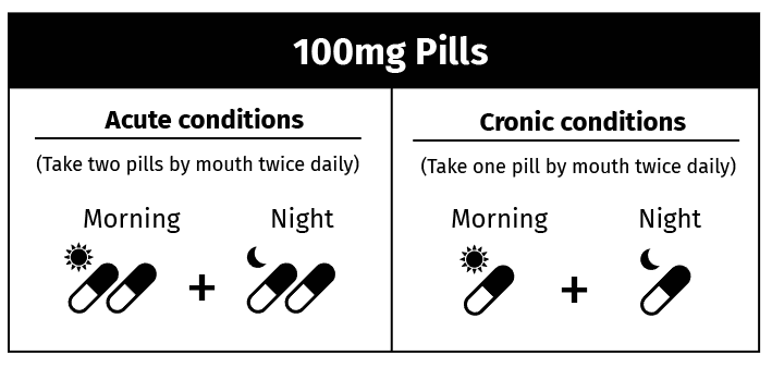
What if we use icons to make a patient information leaflet more understandable?
Using only text with a complex language can confuse the patient and compromise the treatment. So, we’ve created some templates for the leaflets.

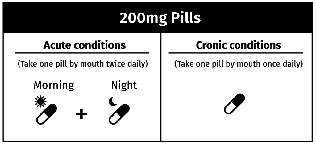
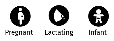
The icons also are useful to explain who can take the pills and who are the safety or risk group:
The goal is to help patients and facilitate the communication between doctors, pharmacistist and the patients in general, so they can have the best treatment. There are many ways to improve communication in science so it’s important to think how science is included is our lives daily.
We created these models of leaflets using Mind the Graph and all these icons are available in our platform. If you want to use them too, start now for free:


Subscribe to our newsletter
Exclusive high quality content about effective visual
communication in science.
