How many of us can say that understand statistics? You may know a bit about some analysis you made for your research, or heard about at a seminar. However, every time a study requires us to understand statistics we don’t know, we get insecure on this topic.
Pretty much all fields in science struggle with statistics. Thus, it is a great opportunity to have a brilliant idea to diminish this struggle and change how things work.
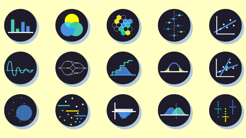
That is exactly what Daniel Kunin, from Brown University, thought. He created a website to explain many types of analysis and to help anyone who wants to understand statistics. The name of this project is “Seeing Theory” – very creative isn’t it?
“As the number of students and the backgrounds of students that are taking statistics grows, I think the pedagogy around statistics has to adapt too, There are a lot of students taking it with less math literacy, but have to to take it for other disciplines. A visual approach might be the link for those students.” Daniel Kunin
“Seeing Theory” website also lets people interact with the types of analysis in a way to promote understanding. This project is already receiving many inputs and feedback to help the approach in getting even easier to understand.
“Kunin’s interactive online resource is called Seeing Theory, and the website features five areas of statistics, including basic and compound probability, distributions, statistical inference, and linear regressions. Each of these topic areas is broken down into a series of three interactive graphs that illustrate concepts while letting users play around with data.” FastCoDesign
Do you still need more arguments about how visual information improves science communication?
Check out these posts:
- Publishing papers with Mind the Graph
- Make your visual abstracts to Annals of Surgery!
- Get visibility for your research with us!


Subscribe to our newsletter
Exclusive high quality content about effective visual
communication in science.
