This post is part of a series of educational material aiming to provide qualified information for scientists and health professional that want to communicate using infographics. Know why infographics are a great tool for your scientific communication.
If you prefer, download your pdf copy of “The Ultimate Guide of Scientific infographics” by Mind the Graph.
What’s the difference between a simple chart and an infographic?
Information design is the practice of representing information in a visual format. A visual representation of information could include visualizing data, processes, hierarchy, anatomy, chronology and other facts. While a simple chart is technically an information graphic, most information graphics are multifaceted and contain explanations or insightful descriptions in addition to charts.
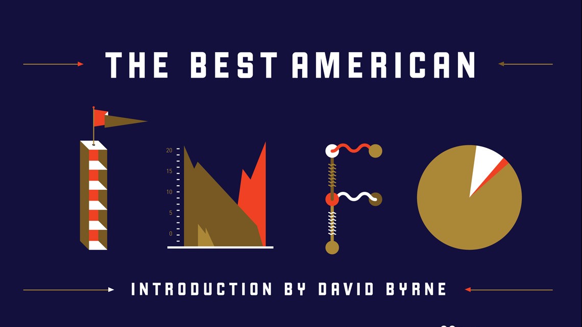
“Infographic” is an abbreviation of “information graphic” and uses visual cues and structured data to tell a story. They don’t need to contain a certain amount of data, possess a certain complexitiy or presente a certain level of analysis. Theoretically, it can be as simple as a road sign that let you know that there is a construction site ahead or as complex as a visual analysis of the global economy. The bottom line is that an infographic uses data and visual elements to tell a story.
This series of posts will guide you trough the many aspects of the infographic creation process in the context of scientific communication. You can interpret this information as a modern way to use your charts, or as a revolutionary tool that will make you leap from the restricted ground of a scientific paper that very few people read to a super attractive communication that will make your science bloom.

The fundamentals
If you are thinking of creating an infographic, I suppose you already have some content to communicate. It is probably the result of your research and it has an utility, which is to impact the audience of a conference talk, poster session or the readers of your paper. True?
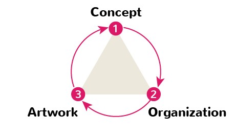
Nice. Then, now you need an infographic. Start with the basics. A good infographic is based on 3 simples principles: concept, organization and artwork. If you follow them strictly, it’s very likely that will end up with an attractive piece of information design to impact your audience. These 3 principles are the essential of what you should pay attention when creating an infographic. We recommend considering each one like a “step” in the creation process. I mean:
- pay a lot of attention to the “idea”, know beforehand what you wanna tell, what is the taking-home message.
- Just then dedicate some time to organizing it visually.
- Finally, you should look for figures and care about artwork styles.
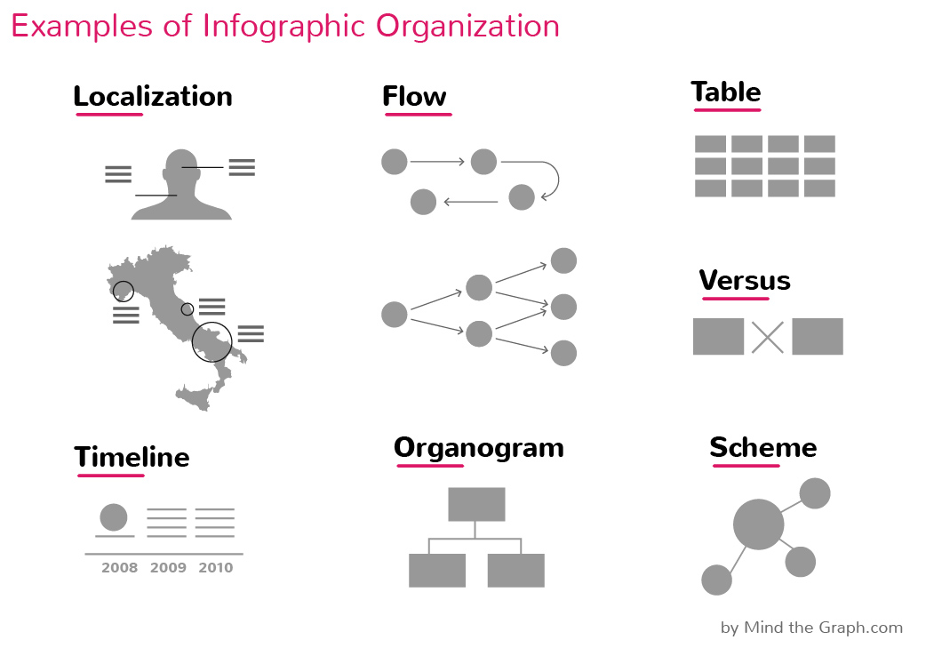
Interesting and useful forms of infographics for scientists are depicted above. You can easily spot some popular organizations and you probably already used at least “localization”, “timeline” and “organogram”. Didn’t you?
We will see how to produce them in more the next posts of this series. The artwork style is what normally strikes the audience, like in these examples of awarded press infographics, but believes us, this is just the end of it.
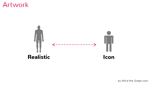
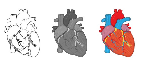
In Mind the Graph, one can exchange from 5 different artwork styles with a simple mouse click.Sweet. Font types and colors are also part of the style, this is the “language” of the infographic. The elements must combine well and constitute an harmonic final image. That’s why your Google Images normally don’t work well… cappicci? If you are ready, jump into the platform and start creating awesome scientific infographics with harmonic illustrations and infographic elements.
Navigate through the guide:
Chapter 1 – What makes a good infographic?
If you prefer, download your pdf copy of “The Ultimate Guide of Scientific infographics” by Mind the Graph.


Subscribe to our newsletter
Exclusive high quality content about effective visual
communication in science.
